In this topic, I explain the modifications I did in the Average Response time graph for Grafana - Jmeter integration. If you configured the integration, the graph will be displayed like this>
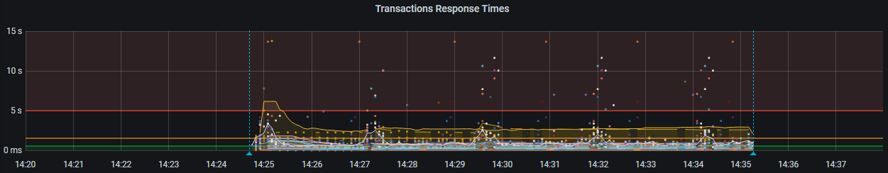
Here the data points are partially visibile and mostly we may not be able to get the most of this chart. Especially, if your test is having more number of transactions, then this will looks glumpsy. To modify this we can tweak some parameters of the grafana chart as below.
To edit the chart click on the drop down icon next to chart legend (in this case Transaction Response Times) . In the menu, click on Edit .

Now you can get the edit screen so that we can customize. Note: If you dont have the edit rights in grafana, you may not be getting the menu.
Look at the query in the query window (If you use influx db as a middle layer) .

In case if you are not getting this query window you can click on the highlighted button to get text query editor. If you want to skip some transactions to be displayed in this graph, you can slightly edit the query.
SELECT mean("pct90.0") FROM "$measurement_name" WHERE ("application" =~ /^$application$/) AND $timeFilter GROUP BY "transaction", time($__interval) fill(null)
You can add addtional filter in the query as below:
SELECT mean("pct90.0") FROM "$measurement_name" WHERE ("application" =~ /^$application$/) AND $timeFilter AND "transaction" !~ /XYZ*/ GROUP BY "transaction", time($__interval) fill(null)
In the place of XYZ you can put your regex or starting letters of the transactions to be hidden. If you want to show only certain transactions you can modify the query accordingly.
By default, a transation named "all" will be displayed in the chart. you can hide that as well by tweaking like this.
SELECT mean("pct90.0") FROM "$measurement_name" WHERE ("application" =~ /^$application$/) AND $timeFilter AND "transaction" !~ /XYZ*/ AND "transaction" = 'all' GROUP BY "transaction", time($__interval) fill(null)
Please note the single quotes and double quotes to avoid mistakes. In case if you want to remove the transaction response times of failed transactions you can set your query like this:
SELECT mean("pct90.0") FROM "$measurement_name" WHERE ("application" =~ /^$application$/) AND $timeFilter AND "transaction" !~ /XYZ*/ AND "transaction" = 'all' AND "statut" = 'ok' GROUP BY "transaction", time($__interval) fill(null)
Now look at the graph visual settings. On the same screen, right hand side we can see three tabs for editing ( Panel, Field and Overrides)
In the Panel - Visualization used to change the chart type but not right now .
Go to Panel - Display tab and look at the Area fill option. If you don't want to shade the chart lines change Area = 0.
Another important option is how to display null values in the chart. Default is null which will show the lines as disconnected and leave more dots in the chart. Change the value as Connected which will connect the data points to make it smoother to view.
After adjusting Area & null value display the chart will look like this:

Now lets adjust the Hover Tool tip. This is the one when we move the mouse cursor over the chart and by default it displays all transaction names and its response time graphs. Our aim is to highlight only the pointed line and its transaction name and detail instead of all . To do this, look for option called Hover Tool Tip in the display section and change to Single as below:

Dual Axis Graphs (Overlay Graphs) :
Let us see how we can create a overlay graph like Loadrunner analysis in Grafana. For example, I need to overlay Vusers (Active Threads in terms of JMeter) on Error count graph. You can pick up the Errors graph from the default Json and click on Edit as we shown above. In the query section, add another query to the graph by clicking on the +Query button. In the query editor enter the below query to plot Vusers on top of Errors graph.
SELECT last("maxAT") FROM "$measurement_name" WHERE ("transaction" = 'internal' AND "application" =~ /^$application$/) AND $timeFilter GROUP BY time($__interval) fill(null)
Now you can see the Vusers (Active threads) line on top of the Errors graph. Some times default area shading will hide the errors. Lets go to the Panel --> Display and change Area Fill to zero.
In the Legends section, turn on Average and current values for Errors for better clarity.
To tune it better , lets change the graph to dual axis graph. One axis for Errors and the other for Active Threads. we need to click on the color line just before the graph legend. I highlighted the area to click for better clarity.


Now we can configure the right Y-axis properties in the Panel -->Axis section. Provide a label name, and if required change the units. The graph will look likes below:

